Brand Identity
This page presents the design framework for Multiple Desk. It establishes how our signature brand elements should be expressed across products, services, and markets, ensuring they are always represented at their best.
Our logo stands as the most recognizable symbol of our identity, a consistent mark across every Multiple Desk communication. It represents trust and quality, bringing together our wide range of products and services under one unified presence.
The logo remains the same wherever it appears, whether in print, on digital platforms, or displayed on our buildings. Its strength lies in simplicity: clear, direct, and free from unnecessary effects such as shadows, gloss, or embellishments.
Our logo is safeguarded from any distracting or interfering elements. We ensure that it is always surrounded by sufficient clear space to preserve its visibility and impact.

Our icon is crafted to remain clear and recognizable at small sizes, but for best legibility, it should never be displayed at less than 45px in height.
Logo visibility across backgrounds
Our full-color logo shines best on clean white or deep blue backgrounds. Avoid placing it directly on photos unless it rests on a clearly defined deep blue or white area, ensuring maximum visibility and impact.
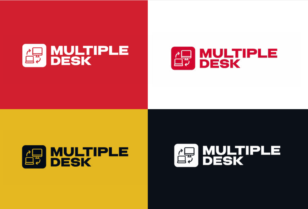
The one-color logo is designed to shine on photographs and colored backgrounds from the Multiple Desk palette.
For monochrome applications, it should appear exclusively in deep blue, cheery red, or white.
For optimal visibility and brand impact, the logo should ideally be positioned on the right-hand side or centered within the layout. These placements ensure balance and prominence across all designs.
Where’s the logo at?
Whenever you can, let the logo shine on the right-hand side, it’s the prime spot for visibility.
If that space isn’t available, center it gracefully to keep the design balanced and the brand front and center.
Landscape
For extra-wide landscape layouts, position the logo on the right side, keeping it vertically centered for a balanced and harmonious look.
Apps, T-shirts, etc.
For app icons, merchandise, and other small-format or single-color applications, use the icon mark alone, centered, with no surrounding text.
No transparency tweaks. Keep it solid.
Do not re-create using any other typeface.
Do not rotate any part of the logo.
Do not shuffle or flip the logo.
Do not use a different color.
Do not distort the logo.
Do not outline the logotype.
Do not use a drop shadow or any other effects.
The company logo must not be altered, distorted, or used in any modified form under any circumstances.
MULTIPLE DESK
- Headlines, taglines & main ad copy
- Social media posts, captions, bios
- Website
- Influencer scripts & short content
MULTIPLE DESK BY JOONELI
- Logo lockup (primary/master)
- Brand voiceovers (TVC, radio, AV)
- Corporate presentations & profiles
- Formal press releases & legal docs
- Regulatory/partnership documents
- Footer/signatures in official letters
When appearing alongside a partner mark, the Multiple Desk logo sits to the left of a single vertical divider, at equal visual weight to the partner logo never smaller, never crowded.